The collection window's Image Gallery tab
The Image Gallery tab of the collection window displays your collection as an array of images. Each record is displayed as a an image, along with a small amount of textual information below the image. While the List view lets you browse through your collection by looking at text information in the data records, the Image Gallery lets you browse visually. Since people often are very good at quickly recognizing familiar images, the Image Gallery is often a better way to find the item you are looking for in your collection.
The Image Gallery follows the same sorting and subsetting rules as the List view: The cells in the Image Gallery are sorted in the same order as the rows in the List view, and if a subset is in effect, only records in the current subset are shown in the Image Gallery. Almost all of the menu-accessible functions available from the List view are also available in the Image Gallery. So, for example, you can perform a search to locate the next record that contains a given search string. The only List-view functions that are not available in the Image Gallery are exporting and importing of data, multi-record selection and deletion (only single-cell selection and deletion are supported in the Image Gallery), and printing (the Image Gallery display is not printable).
View an example of the Image Gallery tab of the collection window: |
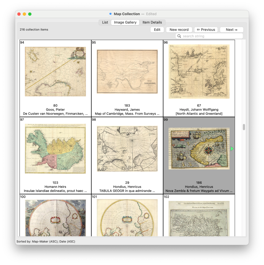
The currently selected record is highlighted (with a gray background). Click on a cell to make it the currently selected record. Double-click to switch to the Item Details display for the selected record. (Typing <Return> will also switch to the Item Details for the currently selected record. Also, you can switch to the Item Details for the currently selected record by clicking on the Item Details tab, or by choosing View Item Details from the Options menu, or by typing the keyboard shortcut: ⌘D.)
For most collections, the Image Gallery will not be able to display all of your records on one screen. Use the scrollbar, or scroll with the mouse's scrollwheel to scroll the display up or down. You can also use the arrow keys to move the current cell selection up, down, left or right. (Hold down the <fn> key and press the up or down arrow keys to move the selection up or down a screenful at a time.)
In the upper left-hand corner of each cell is the row number of this record in the List view. (The List view and the Image Gallery view stay in sync, so the record shown in row 123 in the List view will correspond the record shown in cell 123 of the Image Gallery.) The numbers also help to give you a sense of where the visible records fall, in the overall set of records.
Each cell in the Image Gallery shows just one image at a time. However, if the record has more than one image, green arrows to one or both sides of the image let you browse through the multiple images. (You must first select the cell before using the arrows; they are only enabled for the currently selected cell.) Normally the first image found in a record is the one that is initially displayed. However, in the Recollector editor, you can add a plus sign ('+') before a particular image file name to cause that particular image to be the one that is initially displayed in the Image Gallery. If a record has no images, a text - [No images] - is shown in place of the image.
You can control the size of the Image Gallery's images: Select Recollector > Preferences from Recollector's menu, choose the Images tab, and enter a maximum size (in points) for the Image Gallery images. The longest edge of each image will be equal to this amount. You may specify any value between 25 and 300 points. If you change the image size, the program will recalculate the size of the cells, which may result in a change in the number of visible cells displayed in the Image Gallery window.
You can bring up a separate Image Viewer window on an image by holding down the <Ctrl> key and clicking on an image. This lets you look at the image at its full size, just as if you had clicked on the same image in its thumbnail form in the Item Details tab (or in the Thumbnail Banner of the List tab).
The text information displayed below the image
Each Image Gallery cell shows information from up to three different fields below the image. Normally, the fields that are shown are the first three fields displayed in the List view. (If fewer than three fields are currently being shown in the List view, only as many fields as are actually shown will be shown in the Image Gallery.)
You can, however, specify the fields to display in the Image Gallery independent of the List view's fields. This is done with a Field Profile. To do this, define a Field Profile whose name is Image Gallery. This profile can contain up to three fields. (If it contains more than three fields, the additional fields will be ignored.) The fields in the Image Gallery profile will be the ones used in the Image Gallery labels. Recollector displays up to about 30 characters of text for each of the three labels. Longer values are truncated to fit.
The List tab
The Item Details tab
Searching
Sorting
Subsetting
Field Profiles
Image Windows